Reading Brick, Tile and Concrete at a Street Corner
Reading brick, tile and concrete at a street corner reveals how surface texture and repeated patterns shape a facade’s visual rhythm as you pass.
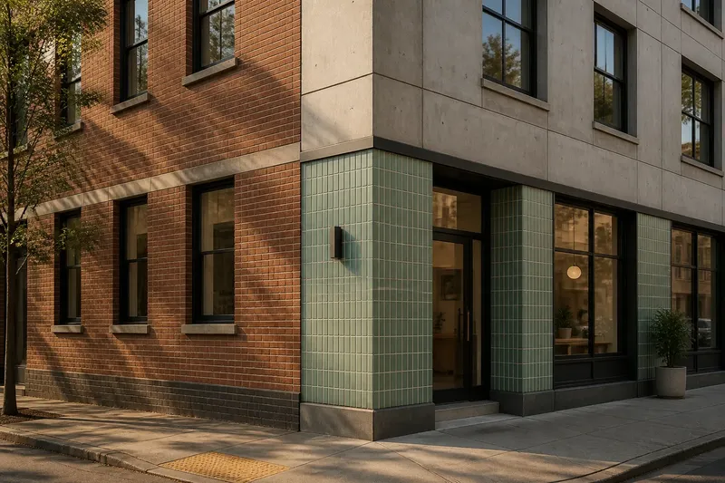
What makes one street-corner facade feel busy and another calm, even when both use familiar materials? Reading brick, tile and concrete starts with the marks your eye can follow: seams, joints, edges, shadows and repeated units. These details organize a building’s surface before you know anything about its design.
The useful comparison is not which material looks best. It is how each material sets up a pace for looking. Brick often leads the eye along courses; tile makes smaller patterns available; concrete can present either a broad field or a carefully divided one. A corner brings these visual systems into view at once, especially where two walls meet and their lines turn, stop or continue.
Start with the surface
Stand across the street, where you can see a stretch of facade rather than one isolated patch. Notice the largest visible divisions first: a wall plane, a band above the ground floor, a window opening, or a change from one material to another. Then move your attention closer to the surface. The scale of the pattern becomes clearer when you can compare it with familiar features such as a doorway, window sill or storefront sign.
Keep three observations separate:
- Texture: the visible or tactile character of the surface, including grain, ridges, smoothness and the way light makes edges legible.
- Pattern: the repeated arrangement of units, joints, panels or marks.
- Rhythm: the pace created by those repetitions across the facade, including pauses and changes.
A material can be smooth yet rhythmically busy if its joints repeat at close intervals. Another can be rough but visually quiet if its surface has few strong divisions. Separating these observations prevents “textured” from becoming a catch-all for every effect a wall produces.
First trace the largest line you can see. Then look for the smaller lines that either follow it or interrupt it.
Brick courses and turns
Brick offers a readable set of units. Individual faces repeat within horizontal courses, while vertical joints shift according to the bond. In a common running bond, each brick overlaps the joint below; the stagger creates a steady sideways movement rather than a grid of uninterrupted vertical lines. Mortar joints make that movement visible, sometimes more strongly than the brick faces themselves.
Look at the difference between a long wall and a corner return. On a broad plane, horizontal courses can pull the eye across the facade. At the turn, the wall’s direction changes, but the courses may carry on around it. That continuation links the two faces. If the bond changes, a vertical band appears, or the brick is laid in a contrasting direction, the corner reads as a stop or accent instead.
Color also alters the pace. A field of closely related brick tones can read as one textured mass from across the street, then separate into individual units nearby. A contrasting row or darker base may make a horizontal division prominent. The point is not to decode a designer’s intent; it is to notice what your eye follows and where it slows.
Compare the mortar with the brick face, not just one brick with another. A pale joint can draw a visible mesh across otherwise subdued units; a close color match can let the bond recede.
Tile in smaller beats
Tile usually offers a finer pattern than brick, though the effect depends on the size of each piece, the joint width and the layout. Square tiles can establish a regular grid. Rectangular tiles laid in offset rows make a denser, directional pattern. Small mosaic pieces can merge into a field at a distance and resolve into individual marks as you approach.
At a street corner, check whether the tile pattern respects the turn. A grid may wrap onto the next face, align with the window openings, or end at a trim strip. These choices affect visual rhythm. A pattern that continues around the corner encourages the two walls to read as one surface; a sharp border makes the turn more explicit. Neither is inherently more successful. Each sets a different beat.
Tile can also reflect light in ways that change its apparent texture. Glazed faces may catch small highlights, while matte surfaces tend to keep the pattern legible without the same sparkle. A variation in color or finish can make the joints less dominant, or sharpen them by contrast. Observe the facade from more than one angle: a surface that looks uniform head-on may become lively as the viewing angle shifts.
For a useful comparison, count the pattern by eye rather than naming it. Is the facade divided into a few broad units, a regular grid, or many small marks that gather into a larger field?
Concrete and the visible joint
Concrete can appear as a broad, nearly continuous plane, but it is rarely visually blank. Its texture may come from a smooth finish, visible aggregate, board marks, shallow grooves or the edges between poured or assembled sections. Those marks can be subtle at a distance and decisive up close.
Pay attention to panel boundaries and joints. A large panel creates a long pause in the surface pattern; a succession of smaller panels makes a more frequent beat. Board marks can supply a second direction, crossing or reinforcing the divisions between panels. If the surface is patterned by repeated impressions, look at how those impressions line up with windows and the corner edge.
Concrete is a useful contrast to brick and tile because the visible unit may be much larger than the material’s surface details. A single panel can contain a grain, a seam and a shadow line, each working at a different scale. From across the street, the panel division may organize the facade. Close by, the finer texture may take over.
Do not treat a plain-looking wall as an absence of rhythm. Its quietness may come from widely spaced joints, a low-contrast finish or openings that supply the main repetition.
Compare the corner
When several materials meet, compare how they handle the same visual tasks. Where does each surface begin and end? Which lines continue across the turn? Does one material set a broad rhythm while another supplies a finer one? The most useful reading comes from these relationships, not from treating brick, tile and concrete as isolated samples.
Say you are looking at an invented corner building with brick on one street face, a tiled ground-floor panel, and concrete around the upper windows. You first notice the brick courses carrying a horizontal line toward the turn. The tile’s smaller grid then marks the entrance as a tighter, more active patch, while the concrete panels create pauses between upper openings. The observable result is a facade with several distinct rhythms, each attached to a different area rather than competing across the whole surface.
Now check the edges between materials. A metal trim strip, a projecting sill or a narrow shadow gap can make a boundary crisp. A flush transition may let textures meet without a strong dividing line. At the corner itself, a visible edge can act like a hinge: the pattern on one face stops, changes direction or continues around it.
One practical habit is to follow a single line across the facade, then repeat the exercise with a different one. A course, joint or panel edge often tells you more than a general impression of whether the building feels “busy.”
Looking questions?
How do I tell texture from pattern?
Texture is the character of the surface, such as rough grain or a smooth finish. Pattern is the arrangement of repeated units or marks, such as brick courses or a tile grid.
Why does the facade look different up close?
Distance changes which details merge and which remain distinct. A field of brick may read as one color from across the street, while mortar joints and surface variation become more apparent nearby.
What should I notice where materials meet?
Look for the boundary’s shape and for lines that continue, turn or stop at it. A trim piece or shadow gap can make the division prominent even when the materials have similar colors.
Does a regular pattern always feel calm?
Not necessarily. A close, high-contrast grid can feel active, while a less regular pattern in muted tones may read quietly from a distance. Spacing, contrast and viewing distance all affect the rhythm.
Read from two distances
A reliable close-looking pass moves between the broad view and the detail. From across the street, note the facade’s largest divisions and the direction of its strongest lines. Closer in, inspect the unit, joint and finish that create those lines. Then step back mentally: ask which details still shape the wall as a whole.
This matters because a surface can change character without changing material. Brick may be a broad field at one distance and a network of joints at another. Tile may shift from a single band to a set of small repetitions. Concrete may seem seamless until a panel edge catches the light. The material name is only a starting point; its visible organization does the expressive work.
Reading brick, tile and concrete at a street corner is therefore a way to notice how a facade distributes attention. Follow courses, grids and joints, watch where they turn, and compare their scale with nearby openings. The next time you pass a corner, pick one line and see how far the building lets it travel.