Why Street Signs Need a Visual Order
Why street signs need a visual order: learn how size, contrast, placement, and grouping decide which message catches your eye and how to read the rest.
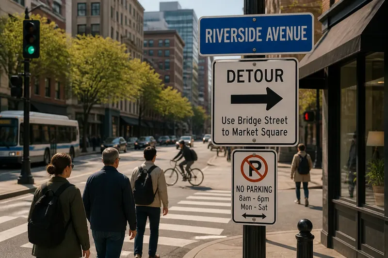
Why street signs need a visual order becomes obvious at a crowded corner: your eye catches the street name, misses the parking restriction, then notices the detour arrow after you have walked past it. Street signs need a visual order because people usually read them in passing, not as a tidy page. Size, contrast, placement, and grouping decide which message arrives first—and whether the next one can be found in time.
Attention Has an Order
A sign can carry several messages: a destination, a direction, a rule, a warning, or a name. If every line is equally large and bold, the reader has to decide where to begin. That extra sorting is the sign’s problem, not the pedestrian’s duty.
Visual hierarchy assigns each message a role. The primary message should be easy to identify at a glance. Secondary information can sit below it or use quieter lettering. Details that matter only after someone stops can be smaller, provided they remain legible at close range.
Hierarchy is not simply a contest in font size. A short word in a bright panel can attract attention before a larger line in low contrast. Position matters too: text near the top or at eye level often gets noticed sooner than material tucked beneath a map, pole bracket, or row of stickers.
At a corner, ask one practical question: which message would you notice while approaching, before deciding where to turn?
Three Ways to Arrange
Most street-sign layouts lean toward one of three approaches. Each can work, but each asks something different of the reader.
One dominant message
This approach gives one item clear priority: a street name, transit stop, or temporary closure. It suits locations where people need a quick answer while walking or cycling. A large, plainly placed label can be recognized before the reader has time to examine smaller information.
The trade-off is that supporting details can become too quiet. A bold street name above a tiny “no through access” notice may identify the street while failing to communicate the restriction. The main message should lead, but it should not crowd out information that changes what a person can do.
Grouped information
Grouped layouts place related messages together, often using a shared panel, heading, border, or alignment. A wayfinding sign might keep a destination name beside its arrow, while a parking sign might keep the restriction and the relevant time window in the same visual unit. This suits places where readers need to connect a label with its explanation.
Grouping can go wrong when unrelated messages share the same box or when a decorative rule makes every line look equally important. The reader should be able to tell which arrow belongs to which destination without tracing the layout like a family tree.
Layered signs
Layered arrangements put information at different levels, such as a main panel on a pole with smaller notices below. They suit streets where permanent directions and temporary instructions must coexist. The larger panel can handle the main decision; a lower panel can carry a short-term closure or access note.
The weakness is physical placement. A lower notice may sit behind a parked vehicle, a shop awning, or the shoulders of people waiting at a crossing. A message can be well designed and still be invisible from the approach that matters.
Choose the arrangement that matches how long someone has to read and what decision the sign needs to support.
Size and Contrast
Letter size establishes priority, but the difference between levels should feel deliberate. If the main line is only slightly larger than the detail beneath it, the hierarchy may disappear at a distance. If it dominates the panel, the supporting message may seem unrelated or unimportant.
Contrast helps separate the words from their background. Dark lettering on a light field and light lettering on a dark field can both be readable when the separation is clear. A colored panel is not automatically high contrast; pale lettering over a saturated background may blur, especially in glare or at an oblique angle.
Typeface also affects how quickly a line reads. Narrow or ornate lettering can fit more characters but may slow recognition. Condensed capitals are common on signs for reasons of space, yet long phrases in all capitals can form a dense block. Short labels benefit from sturdy, open letterforms and consistent spacing.
Look at the sign from the direction people actually approach, not only straight on. Sunlight, reflections, worn paint, and a dark canopy can change the apparent contrast.
Placement and Grouping
Placement determines what a reader sees before reaching the point where a decision is needed. A direction sign positioned after a fork may identify the route but arrive too late to help. A notice set far above eye level may remain visible across a plaza while its smaller text is hard to read from below.
Nearby signs also compete. A street name, parking restriction, business banner, and temporary construction notice may occupy one pole or its immediate surroundings. If each uses a different color, type style, and orientation, the collection offers no clear starting point.
Grouping related signs can reduce that competition. Matching alignment, consistent spacing, and a shared panel can signal that messages belong together. But grouping should preserve useful distinctions: a route arrow should not appear to point toward the next line simply because the lines sit close together.
Imagine a pedestrian approaching a fictional corner with a blue street-name panel above a white detour notice. If the detour arrow is placed beside its destination and the notice sits at eye level before the fork, the expected result is a clear sequence: identify the street, spot the detour, then choose the route. If the arrow is buried among unrelated notices after the turn, the same information is present but arrives too late.
Which Sign Speaks First?
How can I tell what message is primary?
Stand at the point where a person first encounters the sign and note the first words or symbol you recognize. Then check whether that message matches the immediate task, such as finding a street or spotting a closure. If a decorative panel or unrelated notice draws the eye first, the intended priority may be unclear.
Should every sign use the same colors?
Consistency can help people recognize related information, but color alone should not carry the meaning. Contrast, wording, position, and familiar symbols also matter, particularly for readers who do not distinguish colors in the same way. On an existing street, compare neighboring signs rather than judging one panel in isolation.
Why do some signs feel cluttered?
Clutter often comes from competing levels of emphasis: too many large headings, multiple arrows, crowded spacing, or several unrelated panels placed together. Look for the point where the eye hesitates between messages. That pause is a clue that the layout has not made the reading order plain.
Where should temporary notices go?
A temporary notice should be visible before the action it changes, while remaining distinct from permanent street information. Its placement should not cover a name, arrow, or other message people still need. Local rules and the responsible authority’s instructions determine what can be attached and where.
A Street-Level Reading
To assess a sign in place, approach it as a passerby rather than studying it from a comfortable distance. Notice what catches your eye first, what you have to search for, and whether the sequence matches the decision ahead. Try the same approach from each direction of travel; a panel can read clearly from one side and disappear behind a pole from another.
Compare the sign with the objects around it. A dark panel against a pale wall may stand out, while the same panel beneath a deep awning may lose contrast. A large arrow may dominate from across the street but become confusing beside another arrow on a nearby notice. The surrounding street is part of the visual field, even when it is not part of the sign.
Why street signs need a visual order is therefore a question of sequence, not decoration: the right message should catch attention first, and the supporting information should become available when needed. Next time you reach a busy corner, notice which message arrives first—and whether the route gives you enough time to act on it.